
Interface and navigation
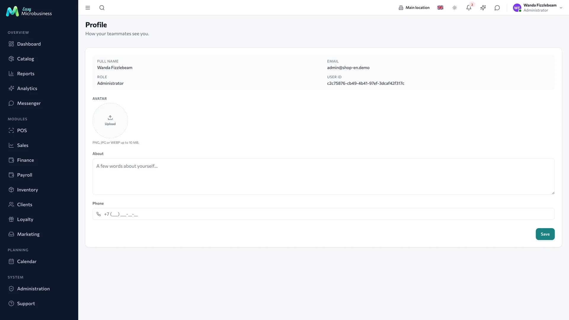
Every section works the same way: the menu on the left, a top bar with search and status, the work in the middle. Learn it once and you will recognise it in any new section.
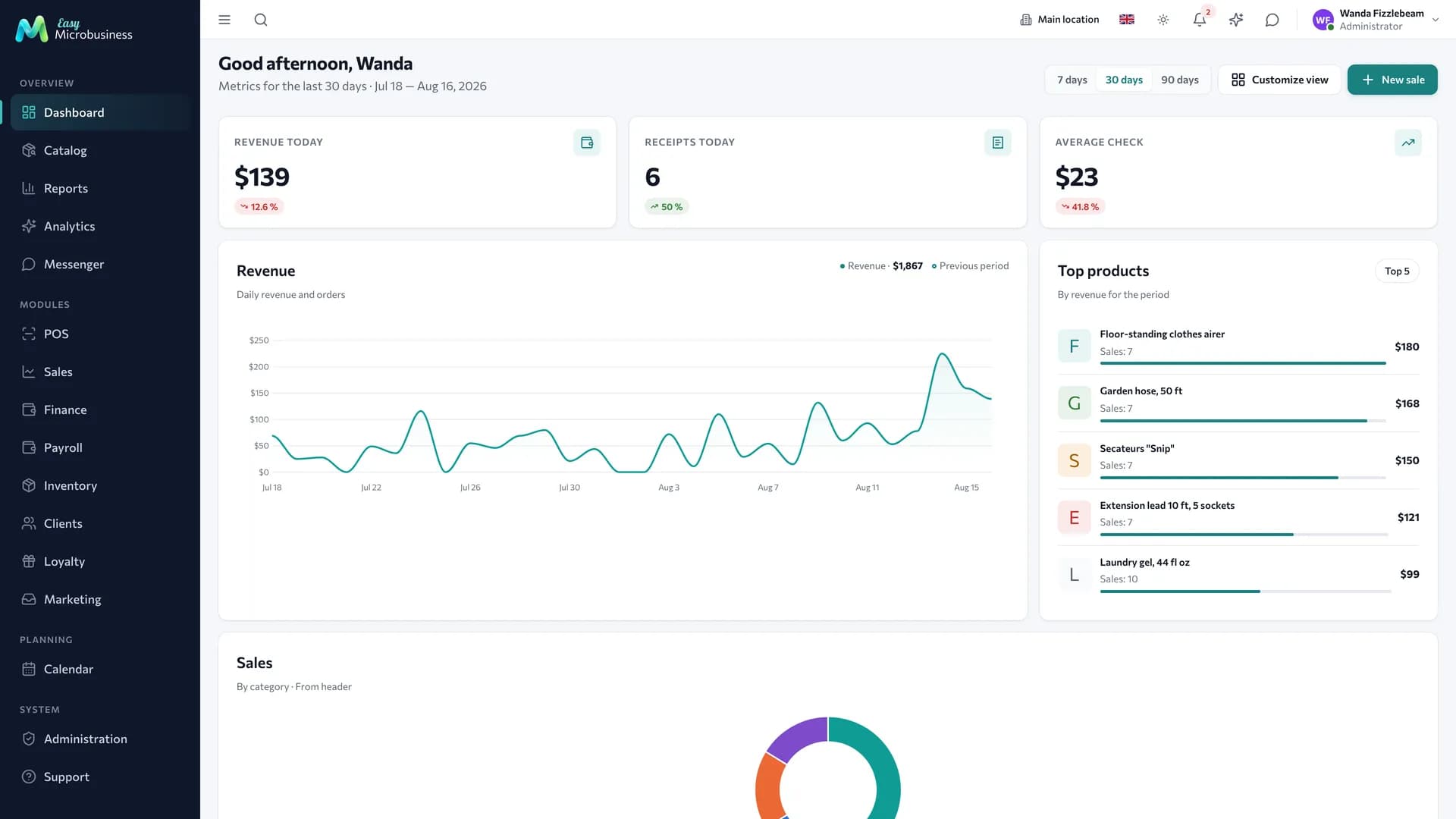
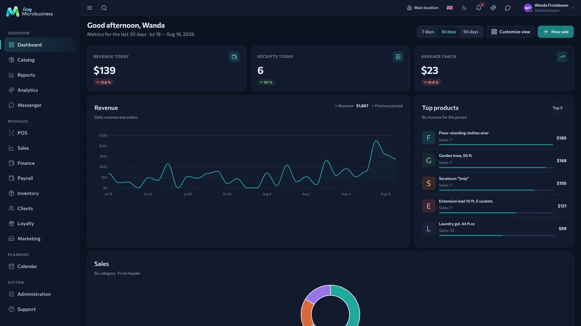
Side menu
The menu is grouped by meaning rather than alphabetically:
- Overview — dashboard, catalog, reports, analytics, messenger: what everyone needs.
- Modules — the working sections of connected components: POS, sales, finance, payroll, orders, inventory, deals and more.
- Planning — calendar, scheduling, work planning, rentals, study groups.
- System — administration and support.
The menu shows what is switched on and allowed for your role. If a colleague sees a section and you do not, look at role permissions or a switched-off component.
The menu collapses with the button above it. On a narrow screen only icons remain; on a phone the menu becomes a drawer.
Top bar
From left to right:
| Button | What it does |
|---|---|
| Search | Looks through customers, products, orders, deals and documents. Results are grouped by type and lead straight to a card |
| Branch | The current location. Switching it changes the stock, shifts and schedules you see |
| Language | The interface language, personal to each user |
| Theme | Light, dark or system. The choice is remembered on the device |
| Notifications | The unread counter: new orders, tasks, analytics signals |
| AI assistant | A chat over your company data: ask, find, create. See AI assistant |
| Support | Opens this documentation in a new tab. Always available and independent of the AI balance |
| Send a request | Report a problem or suggest an improvement — the request goes to support |
| User menu | Profile, presence status, sign out |
On a phone the header keeps the essentials: search, branch, language, theme, notifications and the avatar. The AI assistant and "Send a request" move into the user menu, and the documentation opens at its own address, docs.easymb.ru.
Dashboard
The dashboard is the first screen after login. It is built from widgets, and the set depends on your role and the connected modules.
What you can put on it:
| Widget | What it shows |
|---|---|
| Indicator cards | Revenue today, receipts today, average check, open orders, order amount, total stock — one figure per card |
| Revenue | A chart by day: daily revenue and orders |
| Top products | The items that brought in the most money for the period |
| Sales | A chart of revenue structure: by category or by employee |
| Deal funnel | How many deals reached each stage |
| Today | What needs attention today |
| Classes today | Group classes for today |
| Recent orders | New orders since the start of the day |
| Shipments | The latest handovers of goods to customers |
| Activity | The company event log |
The 7 / 30 / 90 days switch in the header sets the period for every widget that counts over an interval. A single widget can be given its own period.
To assemble the dashboard for yourself:
- Press Customise view.
- Pick a ready set — Owner, Sales or Minimal.
- Drag widgets with the mouse, remove the extra ones, take the missing ones from the palette on the right.
- Split a row into 2, 3, 4 or 6 columns and stretch a slot into the neighbouring one where needed.
The layout is saved for you personally and does not affect colleagues.
Widgets of a switched-off module leave the dashboard together with its sections in the menu. Turn the module back on and the layout comes back.
How any list section works
Customers, Orders, Sales and Deals are built to one pattern, which saves time when moving between them.
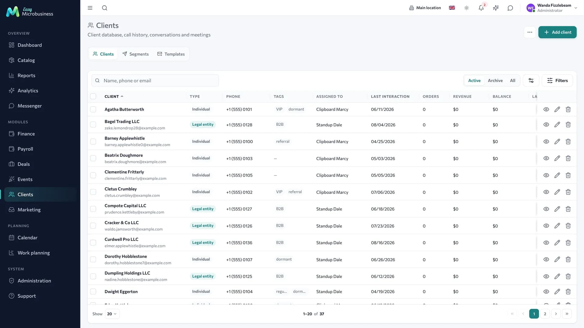
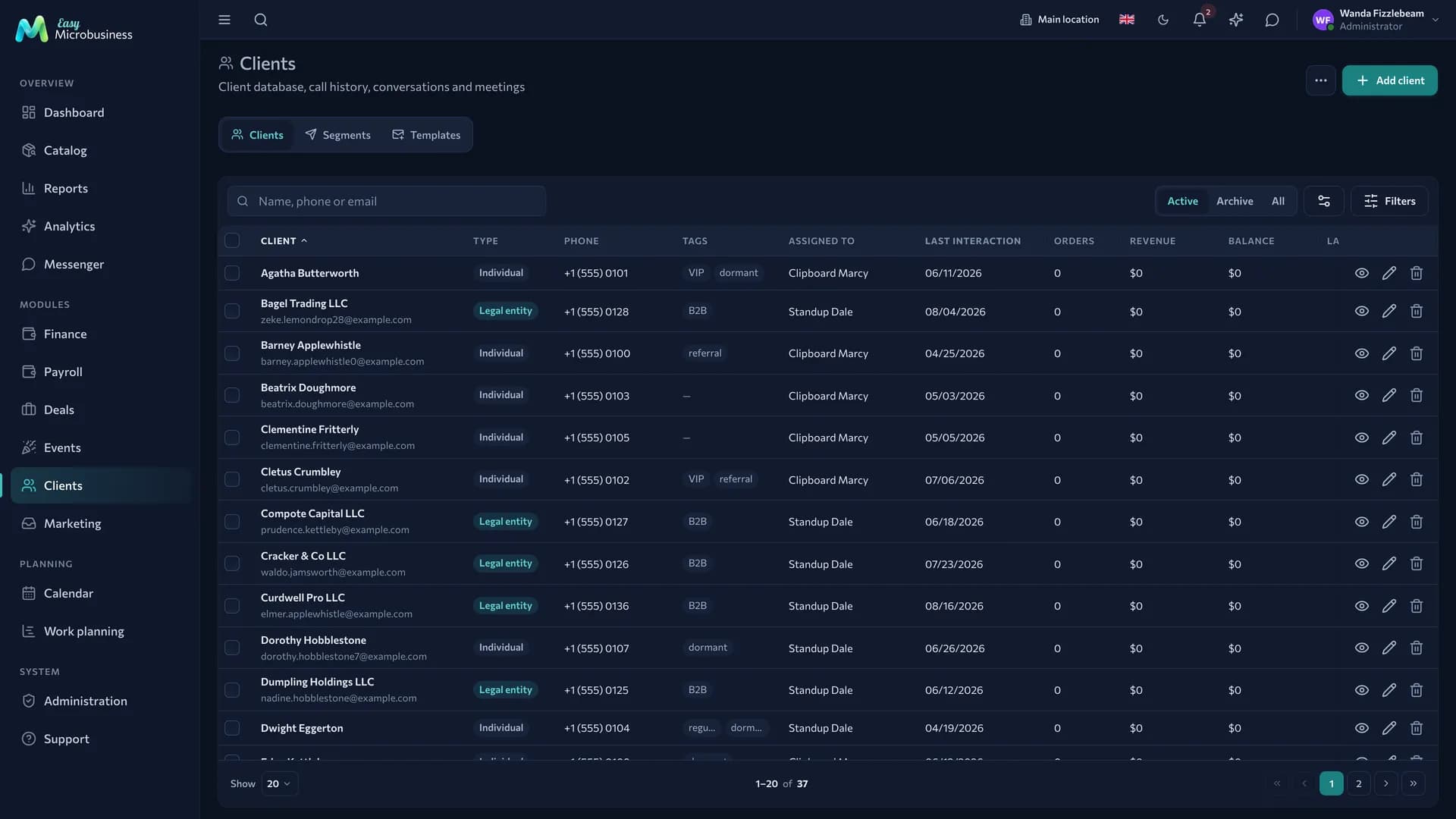
- Section header — all its actions live here: the main button on the right, rare entries under "…". Creation opens in a modal window.
- Filters — text search, statuses, period, owner. Filters are kept in the page address, so a filtered list can be sent to a colleague as a link.
- Table — sortable column headers are clickable and show the direction. The last column with actions is pinned to the right edge and does not scroll away. Delete, cancel and refund are marked in red and ask for confirmation.
- Show more — the list loads 20 records at a time, which is easier to scan.
- Column settings — hide the columns you do not need; the choice is remembered for you.
Clicking a row opens a card: a separate page with all the data, history and files. If you start editing and leave the page, the system reminds you about unsaved changes.
On a narrow screen the table turns into cards.
Presence status
Next to the avatar there is a status: online, away, do not disturb. "Away" is set automatically when you are idle, and "do not disturb" is picked by hand from the user menu. Colleagues see the status in the messenger and in the employee list.
Security and personal settings
Account settings hold what concerns you personally:
- Change password — with the current one confirmed, at least 8 characters.
- Two-factor authentication — an extra 6-digit code from an authenticator app (Google Authenticator, Yandex Key and similar). Turned on by scanning a QR code, turned off by entering the password. Worth enabling for an account with access to money.
- Time zone — personal, on top of the company one. Useful when an employee works from another region.
Mobile and offline
The interface adapts to a phone: tables turn into cards, the POS cart opens as a bottom sheet, the menu hides. The app can be installed on the home screen and opens in its own window without the address bar.
Some operations work without a connection. Sales made offline queue on the device and go to the server as soon as the connection returns. Sending again does not create a duplicate.
Handy tricks
- The barcode scanner works at the POS, in inventory and in stock counts: connect a scanner gun or use the phone camera.
- Filters in the page address — save frequent selections as browser bookmarks.
- Printing — receipts, acts and delivery notes are printed from a document card using templates from Print templates.
In short
- The menu is split into Overview, Modules, Planning and System and shows only what is available to you.
- The dashboard is assembled with the "Customise view" button; the layout is personal.
- Every list works the same: header with actions, filters, table, "Show more".
- Filters live in the page address, so a selection can be shared as a link.